TV Shows and the Cultural Divide
The 2016 US presidential elections ended in an upset victory that even the 2017 Oscar telecast couldn’t top. Among the biggest losers on election night were the pollsters who had for months been predicting an easy win for the candidate who ended up losing. The New York Times has a tip for those pollsters: watch more television.
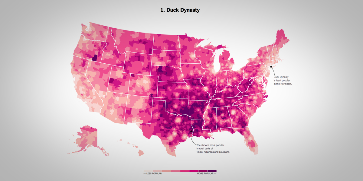
Or to put it more precisely, pay attention to which television shows are most popular in what region of the country. The correlation between, for instance, the popularity of Duck Dynasty and support for Donald J. Trump was higher than that between George W. Bush’ performance in 2000 and Trump’s in 2016.
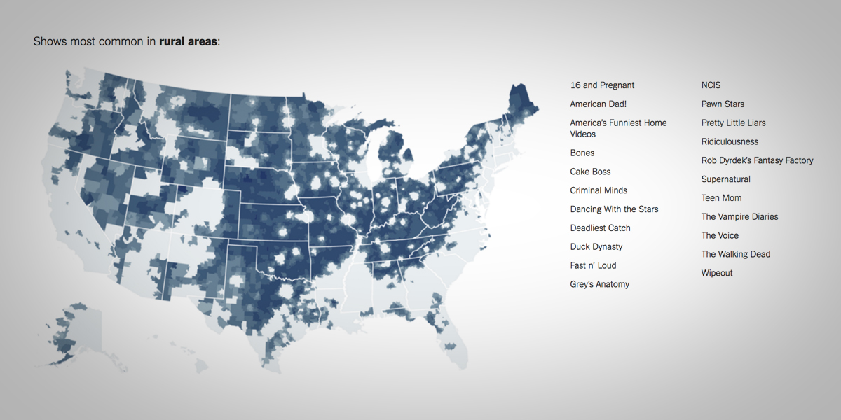
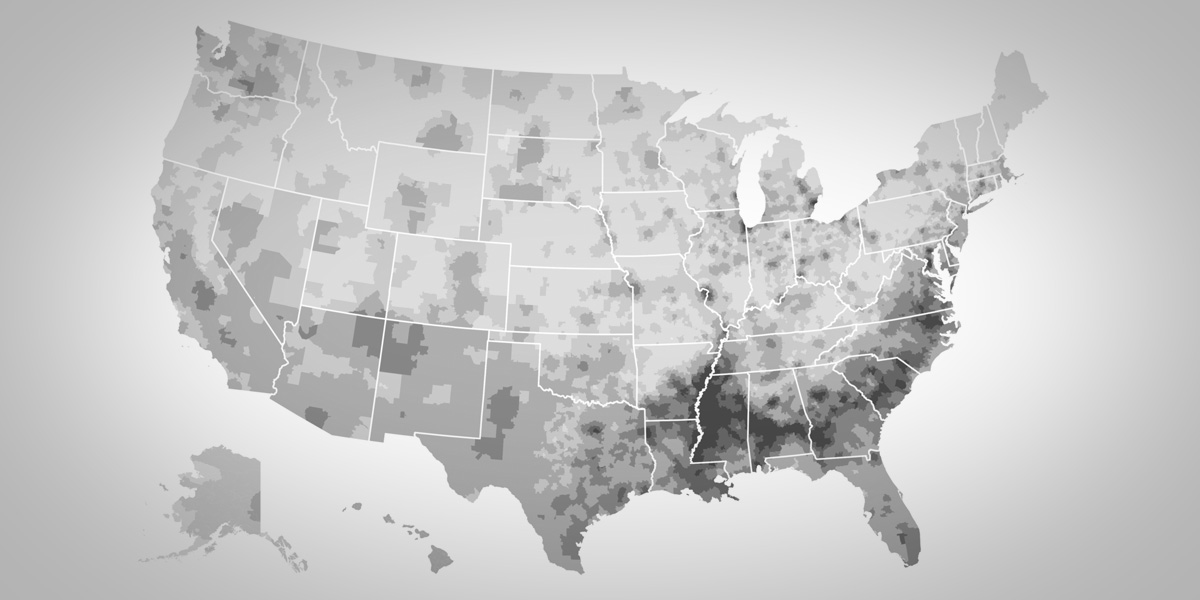
More broadly, the differing popularity of tv shows across the United States in indicative of the cultural divide. The polarization between left and right, between urban and rural areas is reflected tellingly in the viewer numbers of television shows. The New York Times used Facebook “likes” to create an impressive and revealing series of fifty maps, each showing the relative popularity of one given show. A great data visualization of how small screen preferences relate to the bigger political en cultural picture.
A few months after the publication of this series of maps, The Pudding followed the New York Times’ lead with a similar series. Their endeavor shows the relative popularity of the 2017 Oscar nominees, and is equally interesting.


