The Ebb and Flow of Movies
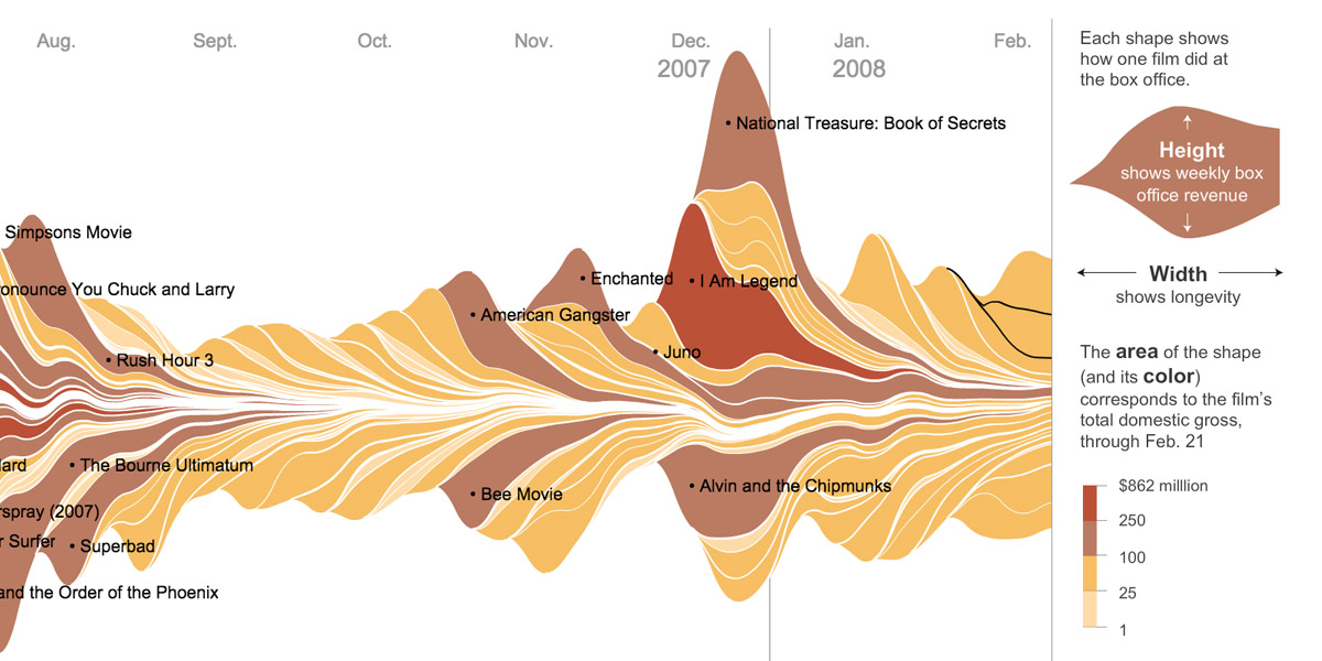
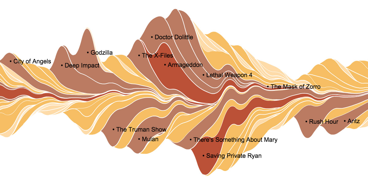
In 2008 The New York Times published a fascinating and interactive infographic showing the box office receipts of all major commercial films released between 1986 and 2007. Each film’s financial returns are rendered in a wave on a timeline, from which can be deduced its total box office haul, its longevity in theaters and the speed of decline in its ticket sales.
This beautifully crafted graph offers insight into how release patterns have changed over the past decades: it clearly illustrates the rising importance of opening weekend profits in the financial career of a movie. (The waveform representing modern blockbusters has a much bigger amplitude in their opening weekend, and a sharper drop-off after that).
The shortening of the waveforms over the sampled period shows that the shelf life of the modern movie is much shorter than it was twenty or thirty years ago. More elongated and flat waves (like that of My Big Fat Greek Wedding) signal sleeper hits that buck the trend. A great example of how an inventive visualization can elucidate even dull and dense data such as box office returns.


